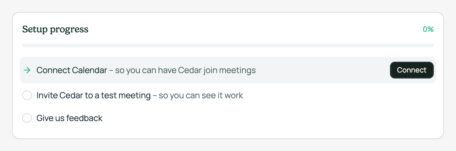
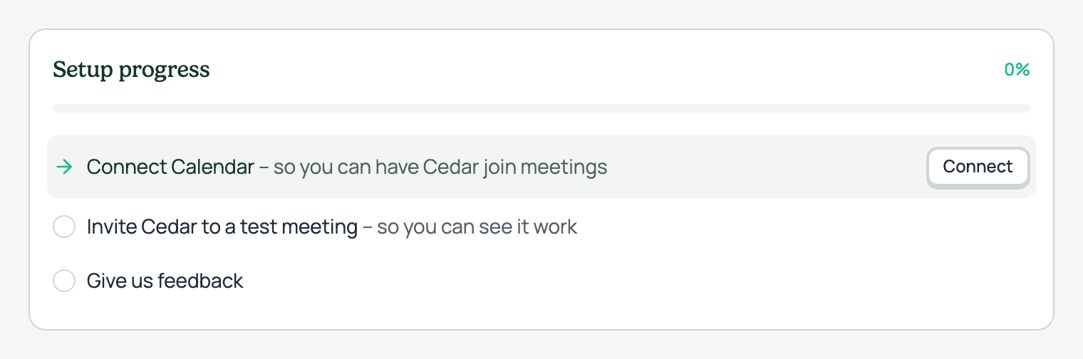
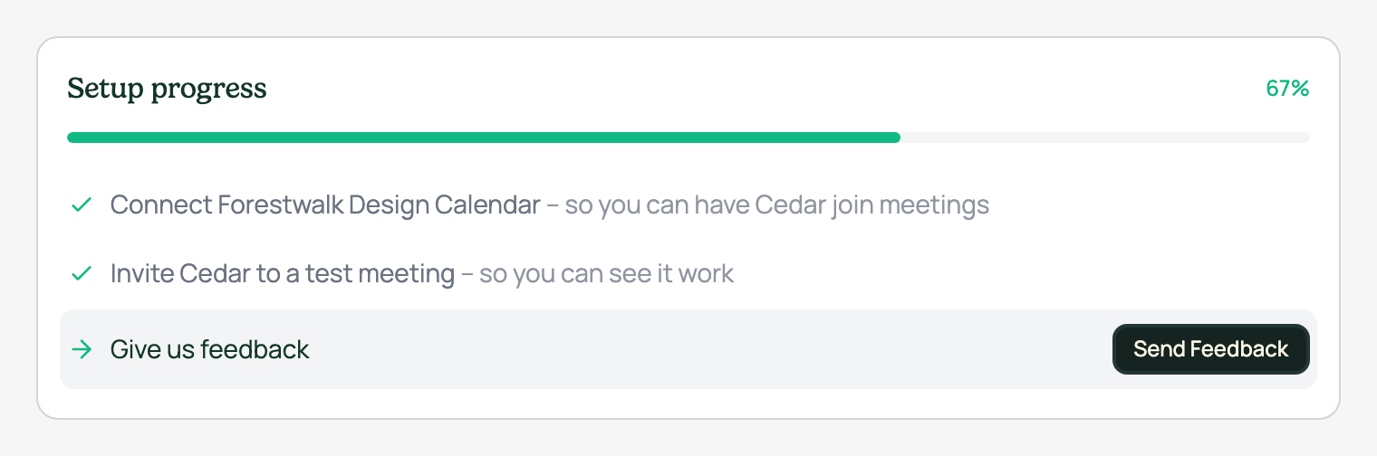
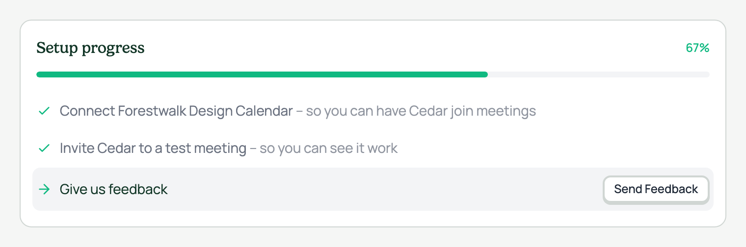
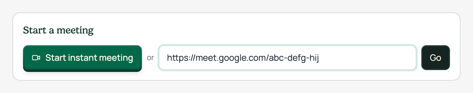
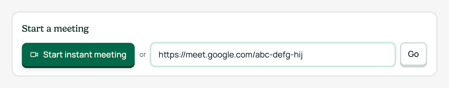
Secondary button · before and after
Every location in the app, old dark secondary vs the new chonky light style
The secondary button gets a restyle: the old dark-surface look is replaced with a light, chonky button that matches the primary's pressed-clay feel. It sits on surface-light with a 2px border and a hard 2px drop shadow, lifts 1px on hover with a deeper shadow, and presses down 1px on click. All colors come from existing design tokens.
Each row below pairs the same location before (left) and after (right): the setup checklist actions (xs), the header Send Feedback button (sm), and the Go button next to the meeting URL field. Shots are captured from the real running app with seeded demo data, on the secondary-button branch versus the commit it branched from.
This restyle folds the secondary button into one consistent voice with the primary: same shape, same motion, different weight. It is one step in the wider button consolidation from the design system audit.
States